on the "About This Model" pages
| Climate Physics Models |
| MODTRAN Infrared Light in the Atmosphere |
| RRTM Full-Spectrum Light in the Atmosphere |
| GHCNM Global Weather Stations and AR5 Models |
| AR5 Climate Model Mapper |
| ISAM Integrated Assessment Model |
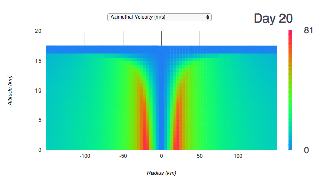
| HURRICANE Tropical Cyclone Model |
| Carbon Cycle Models |
| GEOCARB Geological Carbon Cycle |
| METHANE in the Atmosphere |
| SLUGULATOR CO2 vs. methane |
| HUBBERT'S PEAK Calculator |
| KAYA IDENTITY Carbon Emissions Scenario Generator |
| Cryosphere Models |
| GRANTISM Greenland + Antarctica Ice Sheet Model |
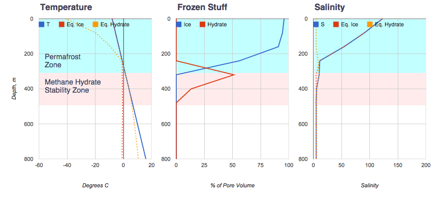
| PERMAFROST Soil T, Ice, and Methane Hydrate |
| Other Models |
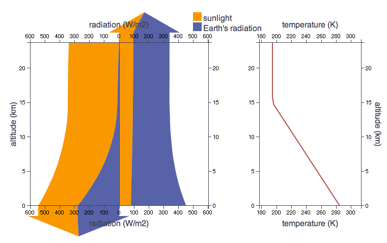
| Orbital Forcing of Earth's Climate |
| New! Suggested Exercises (Things to Do) on the "About This Model" pages |
| Free Coursera Class Using These Models |
| Textbook Written With These Models |
|
|
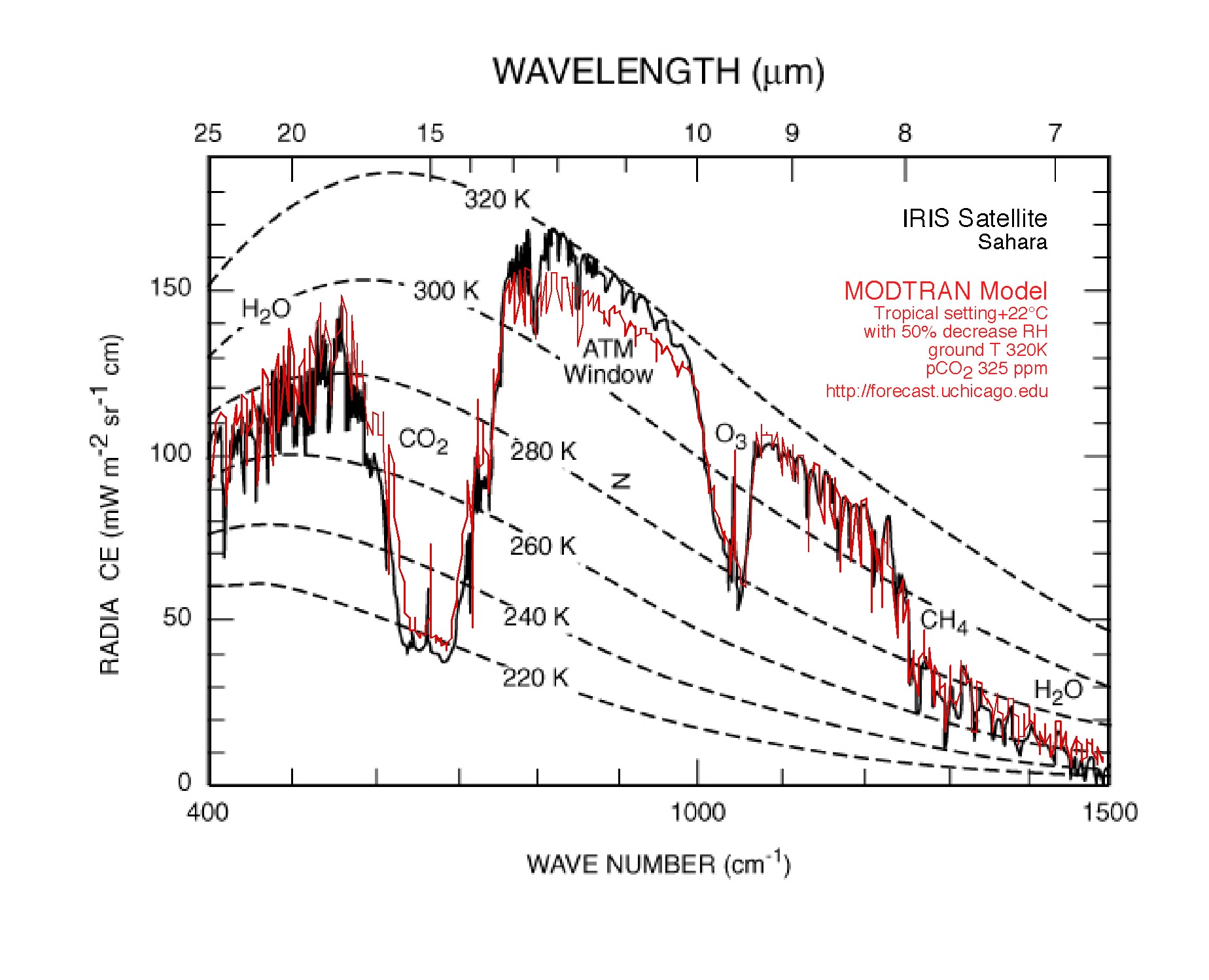
MODTRAN results (red) compared with data (solid black) from the Nimbus 3 IRIS instrumentfrom Hanel et al., 1972).
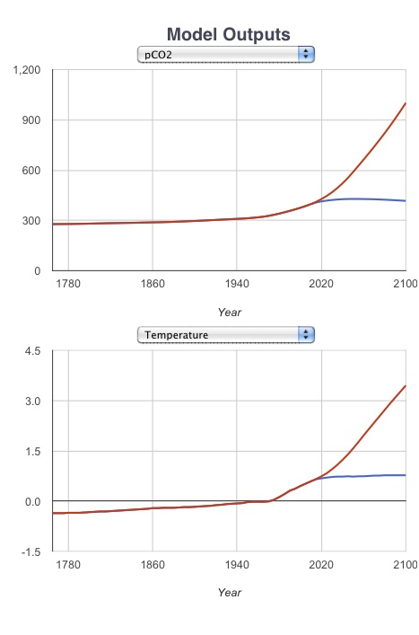
Contrasting atmospheric CO2 concentrations and temperature between the High business-as-usual scenario and a ramp-down 80% decrease by 2050 scenario.
The model runs interactively on your browser while you clobber it by dragging the global temperature up and down, or dosing it with CO2. You can "replay" the forcing history from one run, then drive another run, using a different model configuration, with the identical forcing history, for direct comparison.
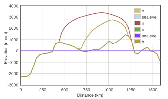
The red and biege curves show the elevation of the Greenland ice sheet after considerable CO2 forcing, for cases with and without Basal Sliding.
This derivative model adds to Berner's original the dynamics of ocean acidification and CaCO3 neutralization of a CO2 pulse, which should improve the simulation on time scales of decades to centuries.
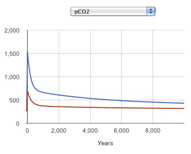
Model atmospheric pCO2 concentrations after 1,000 and 3,000 Gton C spikes, showing the "long tail" as the persistent increase in pCO2 after the spike.
The model simulation goes in three stages. The first is a Natural stage, intended to roughly mimic the natural emission fluxes and atmospheric concentrations in a World Without Us. The second is an Anthropocene stage, where we are at present. The time evolution from natural to industrial is not intended to be realistic, because the real human impact did not switch on suddenly 50 years ago, but the model shows how the methane concentration relaxes toward the steady state in each time period. The third state adds the release of a user-determined Slug or spike of methane, to be released over a user-determined release timescale. If the release time scale is short, the result will be a spike and recovery of atmospheric methane concentration. If it is long, the concentration will reach a new plateau until the end of the slug release.
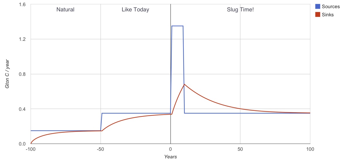
The global sources (blue) and atmospheric decomposition sinks (red) of methane.
The radiative impacts of the two gases differ, with much stronger impact initially from the methane, per gigaton of carbon (Gton C) released. The difference is due to the different starting concentrations in the atmosphere. There is a lot more CO2 than methane in the air, so the absorbtion bands for CO2 are more saturated, and so the impact of another Gton C is less for CO2.
The temperature evolution is controlled by two heat reservoirs: a shallow and a deep ocean. The shallow ocean equilibrates to the radiative forcing in about a decade, and it also exchanges heat with the deep ocean, which sets the pace for the temperature change of the Earth overall. The buildup of long-term "heat pollution" on the planet is simulated by the deep ocean temperature anomaly.
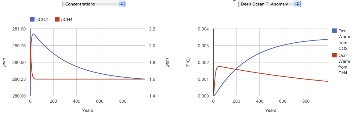
One gigaton of each gas is released at year zero. The concentrations, radiative impacts, and temperature impacts of the atmosphere and the deep sea are all tracked through time.
Hubbert applied the method, in about 1956, to the time evolution of oil extraction from the continental U.S. (top option on the page). The other piece of information he needed was an estimate of the total amount of oil that would ever be extracted. With this, he predicted using the data up that time (1956) that the U.S. would reach peak oil production in the early 1970's. Alter the curve by changing the parameters, and see how much wiggle room Hubbert had to make this prediction.
Today, with respect to World oil production, we are in a postion not unlike Hubbert's, where uncertainty in the total extractable inventory of oil have some impact on how well can pin down the year of global peak oil.
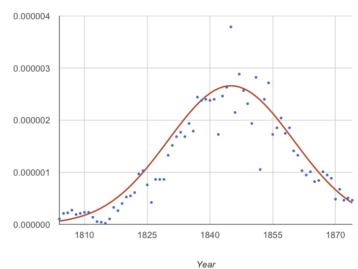
The Hubbert curve applied to Whale oil.
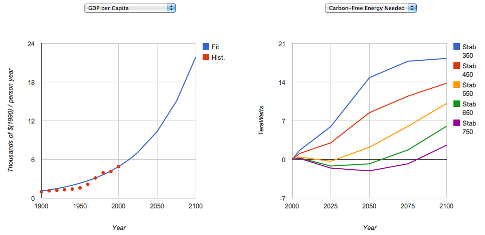
On the right, the GDP per capita as tuned to follow the past historical trend. On the left, amounts of carbon-free energy needed, in teraWatts or 1012 Watts, in order to stabilize atmospheric CO2 at various levels between 750 and 350 ppm.
There are four different scenarios run for each of the models in the list. The Historical scenario is forced by the reconstructed evolution of radiative forcing since 1850, including natural changes (volcanic eruptions and changes in solar intensity), and human-caused changes (greenhouse gases and aerosols mostly). Another scenario, HistoricalNat, only includes the non-human climate forcings. There are also two scenarios for the future. The RCP2.6 scenario shows essentially the climate changes we have locked in so far, without further emissions of greenhouse gases. The value 2.6 is a maximum radiative forcing in Watts/m2. The RCP8.5 scenario is a high-emission scenario.
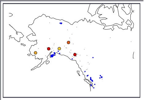
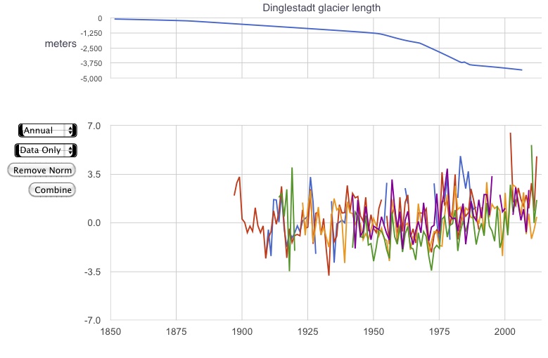
Left A study in tundra. Small grey dots are met. station locations fitting the vegetation classification Tundra. Blue dots are locations of glaciers; the large blue dot is the record shown in the upper time series plot is the Dinglestadt Glacier. The large dots of other colors are selected stations from those on the map in the "tundra" vegetation bin. Right Temperature plots from the selected stations.
For years before 2006 the Historical climate forcing is used, which is a reconstruction of both the anthropogenic and the natural climate forcings. For years after this, the RCP8.5 scenario is taking to represent "business as usual". Temperature trends from these two scenarios can be compared with "Historical (Natural only)" forcing and a low-emission future scenario, "RCP2.6", in the Time Series Browser.
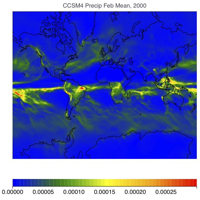
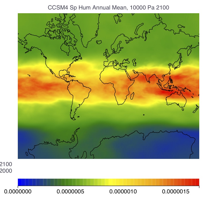
Left, Precipitation From the CCSM4 model, February 2000 monthly average. Right, change in specific humidity in the upper troposphere between 2000 and 2100 in the RCP8.5 scenario of CCSM4.
Wobbles in the Earth's orbit around the sun cause the intensity of sunshine to vary as a function of latitude and season. The Earth's axis of rotation tilts with varying obliquity on time scales of 40 kyr, the direction of the tilt rotates (precesses) on a cycle of about 20 kyr, and the eccentricity of the Earth's orbit around the sun varies with cycle times of 100 and 400 kyr.
 |
The University of Chicago 5801 South Ellis Ave Chicago IL 60637 773.702.1234 |