For years past the Historical climate forcing is used, which is a reconstruction of both the anthropogenic and the natural climate forcings. For the future, the RCP8.5 scenario is taking to represent "business as usual". Temperature trends from these two scenarios can be compared with "Historical (Natural only)" forcing and a low-emission future scenario, "RCP2.6", in the Time Series Browser.
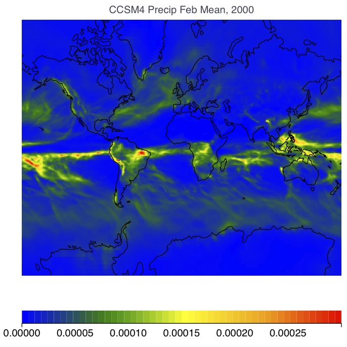
Precipitation From the CCSM4 model, February 2000 monthly average.
| Surface Temperature | ° C |
| Atmospheric (3D) Temperature | ° C |
| Specific Humidity | kg/kg |
| Cloud Fraction | 0-1 (unitless) |
| Precipitation | kg m-2 sec-1 |
| Leaf Area Index | m2 / m2 |
| Soil Moisture | kg m-2 |
| Runoff | kg m-2 s-1 |
| Snow Cover | % |
The model trajectories consist of the Historical forcing for the period 1850-2006, and a business-as-usual scenario called RCP8.5 for the future.
Plot settings include a selector for the annual mean versus specific monthly values, and an averaging option. Using these controls you could get, for example, the average of 10 January values, or an annual average for only a single year.
Download a map by inputting a year, changing the Annual / Monthly selector, or clicking on the Download Map button. A color field representing the 2-D array of values will fill in the map, as keyed by the color scale bar below. Probe the values in the model output array by clicking on the map. Rescale the color bar by clicking the newly appeared Zoom Color Scales button or on the color bar itself.
Download a second map for comparison with the first. It might be interesting to see the variable changing through time by selecting another year. You can quickly compare the two maps by mousing over their entries in the list of downloaded maps in the lower left part of the screen. A Calculate Anomalies button has now appeared, which acts on "families" of maps (which come from the same model and variable). The value from the earliest year of your selected maps is subtracted from the subsequent years.
If you download more maps than just two you can shuffle through them as movies. Download 6 or 12 maps covering the seasonal cycle by selecting different months of a given year, or get maps every 10 or 20 years between 1950 and 2100. When more than one map has been downloaded, a button appears which makes a slide show by rotating the map shown every 1 second, which is about enough time to keep track of the changing year, month, model, or whatever series you can contructed. When the slide show is running, the button prompts you to amp it up into a movie with 4 frames per second, which makes it easier to see motion in the model output fields.
| See high-latitude amplification in temperature anomaly maps. |
| Water stress: compare precipitation and soil moisture changes between different models. |
| Document the ice albedoe feedback in action by making maps of snow cover through time. |
| See the water vapor feedback by comparing the low-level water vapor concentrations of a model through time. |
 |
The University of Chicago 5801 South Ellis Ave Chicago IL 60637 773.702.1234 |